Your Guide to Data Storytelling
September 08, 2020 by Sarah Mottaghinejad

Telling stories is second nature. Everyone does it — we share about our days around the dinner table and tell our friends about the funny things we saw our pets do.
But for some reason, the "data" in "data storytelling" can be intimidating. This craft is really no different.
Data stories, and knowing how to tell an effective one, are pivotal to my role as the senior curriculum designer at Tyler Technologies. My goal is to help government teams tell effective and engaging stories, harnessing those same skills we use in meetups with friends and at the dinner table.
When most people think of data storytelling, their instinct is to turn to visualizations: Add some charts and you've got a story! But you still need characters and a narrative; the maps and graphs are only one piece. Effective data storytelling gathers up all sorts of small data points and provides meaningful context around them.
The most compelling stories — those that inform, persuade, and engage your audience — combine data, analytics, a point of view, and real people. They give readers a "Call to Action" that not only outlines the next steps, but also inspires them to take it.
That's why I love this quote from James Richardson, Research Director at Gartner. He says, "A data story starts out like any other story, with a beginning and a middle. However, the end should never be a fixed event, but rather a set of options or questions to trigger an action from the audience. Never forget that the goal of data storytelling is to encourage and energize critical thinking for business decisions."
In my role, I'm often asked, "What is the trick to telling a good story with data?" There is no trick. Just do it. That's how you get better. I do give people a framework to make sure any story is on the right track. If you're having trouble getting started, follow these guidelines and remember, you can do it! There is nothing more human than telling stories.
Character Exposition: Humanize Your Story
Experiences and personal stories have an emotional heft that draws people in and engages them with an issue.
Use examples and anecdotes in your data storytelling, but keep in mind that the "data" portion is just as important as the "story" aspect. The two factors work in unison, with data supporting your story.
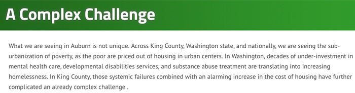
In Auburn, Washington, a data story about homelessness puts people at the center of the issue, sharing a video featuring unsheltered residents. Throughout, the story is a sympathetic one, acknowledging the complexity of the issue.
I like to share a classic example of the importance of telling a story thoughtfully, and not relying solely on data. Two medical professionals attempted to standardize handwashing, but only one was successful. In the 1840s, Dr. Ignaz Semmelweis, the pioneer of antiseptic procedures, confronted his peers — fellow doctors — with the data about the benefits of handwashing, but his attempts to make handwashing commonplace were unsuccessful.

Photo credit: Provence/Flickr
Doctors felt attacked and blamed by his data and tactics. Contrast that with Florence Nightingale, the founder of modern nursing, who succeeded where Dr. Semmelweis failed. Her efforts to encourage handwashing also relied on data — beautiful visualizations that showed the connection between disease avoidance and clean hands — but also had an emotional appeal (and avoided blame entirely).
Bottom line: A battalion of numbers is less likely to inspire action than a personal narrative, buttressed with thoughtful use of data such as visualizations and called-out stats.
Climax: Interpret Data with a Point of View
When you're telling a story with data, be clear with your point of view. This is where opposition comes into play.
That said, point of view shouldn't be conflated with bias. A biased perspective implies that a person unfairly prejudices the result in favor of a person, group, or approach. The goal is to have a perspective — a point of view — with a neutral value attached to it.
Strengthen your stance by seeking out dissenting opinions and rebutting opposing approaches. Give visibility into the alternatives or decisions examined, and back that up with facts.
Resolution: Move the Story Forward
Avoid dead ends as you develop your data story.
After people absorb your story — whether it's shared in a presentation or on a website, such as a Socrata Perspectives page — there should be a clear next step, or a call to action. This can include collecting more data, brainstorming strategy, changing a policy, or any number of options.
Choose what makes the most sense and make it a priority to provide a path forward. Remember, you're telling a story, not just sharing numbers.
Imagery: Visualize the Data
Help your audience to easily absorb complex information by presenting it in an approachable way.
Visualizations help your audience understand large datasets, spot trends, and recognize the point you want them to see.
Pennsylvania, a state hard hit by the opioid crisis, uses a map to make it clear which counties are most affected. The darker the blue, the higher the concentration of opioid-related deaths.
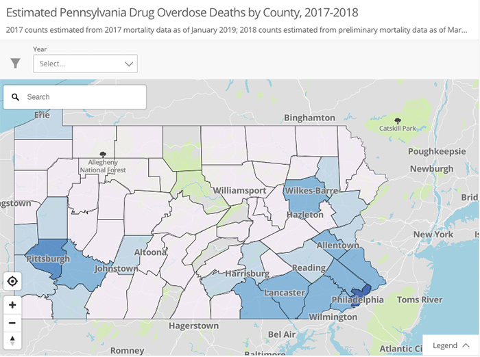
On Open Data PA, the state provides information on the health crisis.
By making your story human, interpreting the data with a unique point of view, calling out clear steps for action, and illustrating with compelling visuals, you'll be on your way to making measurable change.